 Digital printing refers to methods of printing from a digital based image directly to a variety of media. It usually refers to professional printing where small run jobs from desktop publishing and other digital sources are printed using large format and/or high volume laser or inkjet printers. You would use this process of printing when you are printing from a computer using an ink jet. There are many companies that are using this process such as HP , Dell, and many others. I prefer HP though i love there products
Thursday, October 21, 2010
Lets Get Digital
Digital printing refers to methods of printing from a digital based image directly to a variety of media. It usually refers to professional printing where small run jobs from desktop publishing and other digital sources are printed using large format and/or high volume laser or inkjet printers. You would use this process of printing when you are printing from a computer using an ink jet. There are many companies that are using this process such as HP , Dell, and many others. I prefer HP though i love there products
DaFaonts are Hot
 Dafont is a web site that lets you download free fonts from many of contributing artist.
 Fonts are categorized by theme, and can also be sorted by name, date, and popularity. The site also allows users to enter custom text when previewing fonts. The website is rated between 1,000 to 1,050 across the globe. Some of the top authors are Kimberly Geswein , Manfred Klein , and my Favorite Author Douglas Vitkauskas. The Top Three Fonts are Justice, Jellyka Western Princess, and California.
Wednesday, October 20, 2010
Printing Process
Engraving

Engraving is a process by which grooves are cut into a hard surface. This process is usually done to create elaborate images, or advertisements on the available surface. Suitable materials for engraving include (but are not limited to) steel, glass, and gold. Engraving by hand has typically been replaced by other means of image and text printing, due in part to the difficulties associated with becoming a master engraver. A more common way of engraving now would be to use a CNC machine, which may even use a laser to engrave certain pieces.
This process was (and still is) typically seen on vases, commemorative plaques, watches, and even headstones for graveyards. Below is an example of how a CNC router/engraver works.
Foundry Review

The Fonts.com™ store from Mono-type Imaging offers more than 150,000 font products for you to preview, purchase and download. You can also learn about new typeface releases and discover typographic tips and techniques.
Based in Woburn, Mass. with regional offices in the U.K., Germany (Linotype), Mt. Prospect, Ill., Redwood City, Calif., Boulder, Colo., Japan and China, Mono-type Imaging is a global provider of text imaging solutions for manufacturers and developers of consumer electronics devices. Some of they're besting selling fonts include: Futura, Neue Helvetica, Frutiger, Interstate etc... Here is a link to more popular fonts, and foundries.
Most of their fonts are at more of an affordable price than there competitors for example Fonts.com has a particular font that I like named Lomo. You can buy either the full package of these fonts for $1,661.00 or just specific fonts from the Lomo collection for $54.00 each. There biggest competitor which just about everyone has mentioned in the blogs is Fontshop.com
They offer the same Lomo font but they don't offer it in single fonts, they sell it as a whole with 37 fonts for $1,499.00.
digital imaging printing process:
Gathering your information i.e image, text or both through an analog means like scanning in your document or through a digital means like a camera or word processor document.
converting your information; your file format needs to be converted to a usual file such as TIFF or EPS.
Gathering your information i.e image, text or both through an analog means like scanning in your document or through a digital means like a camera or word processor document.
converting your information; your file format needs to be converted to a usual file such as TIFF or EPS.
Typeface Profile.
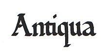
This is one of the most common forms of typeface and is, in fact, notable. The opposing form of typeface wherein the lines in the letters are broken up is known as black-letter. Antiqua type faces are modeled after antique Roman and Carolingian writing. Antiqua typefaces are those designed between about 1470 and 1600, specifically those by Nicolas Jenson and Aldine roman. Antiqua script is called old style, differentiated from modern styles by the more or less uniform thickness of all strokes and by slanted serifs.
History of Type.

Pictogram-History
While cave paintings, dating as far back as 20,000 B.C. are the first evidence of recorded pictures, true written communication is thought to have been developed some 17,000 years later by the Sumerians, around 3500 B.C.
They are known to have recorded stories and preserved records using simple drawings of everyday objects, called pictogram.
Pictogram- Modern uses
Pictogram remain in common use today, serving as pictorial, representational signs, instructions, or statistical diagrams. Because of their graphical nature and fairly realistic style, they are widely used to indicate public toilets, or places such as airports and train stations.Pictographic writing as a modernist poetic technique is credited to Ezra Pound, though French surrealist accurately credit the Pacific Northwest American Indians of Alaska who introduced writing, via totem poles.
Tuesday, October 19, 2010
Printing Process
From extensive searching and asking many Graphic Designer students, I have come across and artist by the name of Andy Warhol, a famous artist mostly renowned for his silkscreen pop art of Marylin Monroe. Now, the process of silk-screening is very difficult as in you have to start from scratch and the materials are not exactly easy to get. I may try to do my own when i figure out how to get every thing together and make it a project. From the way it is done, many different processes and projects can be done.
I would actually recommend doing a movie poster this way because you can control the negative spacing while painting. Being in control of how you can form the lettering without having to use a pre-formed platform makes this a more profitable way to enjoy making something that is your own. (I apologize for not having a picture, the button wouldn't let me click it.)
"http://www.reuels.com/reuels/Silk_Screen_Printing_Instructions.html">http://www.reuels.com/reuels/Silk_Screen_Printing_Instructions.html


History of Asian Typography

The history of typography is a very broad topic to cover. For instance, many countries around the world have their own take of how they print their own lettering. Many countries have started with wood, steel and ink. One country in particular, Japan, has a very unique way of creating type. During the feudal era of Japan, many of the writing were done by calligraphy, which is the painting of letters with a brush of various tip sizes and a small well of ink. This was a painstakingly long and tedious endeavor.
As the turn of the century came, the wooden blocks were made as was a different method of lettering. Each wooden block would have a word embossed in the wood and each block would painted over with ink and lined up in an order desired. they are then placed in between two wooden presses and pressed down upon with force. The picture provided has a form of the woodblock pressing on a tranquil Japanese scroll.
In my own personal belief, the Japanese lettering can also be counted a-s an art form as well as well as a historical advancement of mass production of documents.
Foundry Review

Linotype.com is a large online font retailer, offering a collection 10,000+ fonts for sale. The company itself is part of Linotype GmbH, which is actually the current form of the original Mergenthaler Linotype Company. They have partners in over 20 countries around the world, and hold 30+ awards from 1998-2010 for their various individual fonts and font collections.
Their top 5 sellers are Neue Helvetica, Helvetica, Avenir, Optima, and Rotis Sans Serif. Pricing for single font weights starts at $26. This is fairly affordable for someone needing only one or two types for a given font face. A competitor of Linotype.com is FontShop. Both companies offer reasonable pricing for font collections (FS does have some pricier offerings with their top sellers), although FontShop seems to offer a larger amount of fonts overall.
I would say that Linotype.com is a competitive retailer. They have a nice collection of font families on their website, and very reasonable prices as well. Their offerings seem to suit a wide variety of customers in a number of fields.
Typeface Profile

Designed by A. M. Cassandre in 1937, Peignot is a sans-serif typeface. It does not contain a set of traditional lower case letters. Instead it uses a mixture of smaller capital letters and some lower case letters. The font reached its peak of popularity through the mid to late 1940s, seeing a decline in use throughout the 1950s. Currently it is a trademark of the Linotype Corp. (licensee of Linotype GmbH), and is sold either individually or in packages through Adobe (as part of Adobe Font Folio).

History of Typography
Mergenthaler Linotype Company
Founded in 1886 by Ottmar Mergenthaler, the primary function of this company was to market Ottmar's linecaster machine. Known as the Linotype typesetting machine, this invention revolutionized how typesetters went about completing their jobs. It was most commonly used within the newspaper printing business.

Before Mergenthaler's machine, typesetters needed to place individual letters and characters by hand. This was obviously a very labor intensive process, with a lot of room for improvement. The Linotype machine automated a majority of the typesetting process, allowing the operators to set type for a much greater number of pages during hours of operation.
Printing Process- Letterpress
How it looks.
Your type or image will be indented into the paper. Using a raised surface printing plate or type, the depth of the resulting "bite" will vary depending upon the type of paper. Thicker, softer papers will carry a deeper impression than hard or thin papers.
Your type or image will be indented into the paper. Using a raised surface printing plate or type, the depth of the resulting "bite" will vary depending upon the type of paper. Thicker, softer papers will carry a deeper impression than hard or thin papers.
Warnings.
 .
.
Usually you don't want to print a photograph or fine dot screen by letterpress. Most papers you want to print on will cause images to look a bit muddy. Metalic inks, such as silver or gold, do not print shiny on most papers. If metallic is a priority, check out foil stamping.
The raised surface of the plate can be achieved by a number of means, such as handset type, wood carving or engraving, or, most commonly, photoengraving.
A company that sells Letterpress cards etc. is
I would use Letterpress for any special event because of its qualities. Receiving an invitation that has fine, raised lettering and design seems more special than one that could have been printed off of a home printer.
Foundry Review
Many beautiful fonts are sold by Adobe Type, such as Kigali™ Std Roman (above Adobe's logo). Adobe is located on 345 Park Avenue in San Jose, California. Some top designers for this company are Cleo Huggins, Laurie Szujewska, Christopher Slye and Carol Twombly.
Prices range from 29 dollars to almost 400 dollars and over 2,000 of these are included in an "Adobe Font Folio" that sells for about
2,600 dollars. Check these crazy prices out here!
The font shop is probably a competitor not because it sells fonts cheaper, but because singular fonts are easier to browse on it's site.
Monday, October 18, 2010
digital printing

I chose the digital printing of the printing process. I like this type of print because its faster and takes less time. You dont have to make any printing plates in order to print your final product. This kind of print also can come out more precise and fits to your aesthetically liking.
Digital imaging printing process:
- Gathering your information i.e image, text or both through an analog means like scanning in your document or through a digital means like a camera or word processor document.
- converting your information; your file format needs to be converted to a usual file such as TIFF or EPS.
You can use this type of print for banners, posters, business cards,brochures, advertisements etc. I found a website that sells this kind of printing process. DIGITAL PRINTING
The Revolutionary Revolt
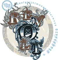 Revolt Is A Font That was Created By Douglas Vitkauskas
Easy The Revolt font was created in 2008.
VTKS Revolt is the third popular font in DaFont’s free font top 100.
OnxyDesign interview Vitkauskas on why he sells his font for free?
Like a true designer he says
That excellent way of letting people know his work, and also it good to know that he's getting involed in other peoples work.
You can use this font on posters and to even edit pictures. A great website to edit pictures with this font is Picknik.
Printing Process - Thermography

What is Thermography?
-Commonly known as poor man's engraving, thermography produces raised printing similar in appearance to engraving but uses a different process. In thermography a special powder is added to the ink that is used for printing. The printed piece is heated and the powder and ink mixture dries to forma raised effect on the paper. This process is also known as offest thermography and raised printing.
Thermography Process
-Thermopgraphy is sucessful when the powdered resins are applied to a printed surface on which the printing ink is still wet. This enables the powder to stick to the printed areas. Any powder on non-image areas, and any excess powder on the image areas is suctioned off before the heating takes place. Heat is then procduced with an electric element; which are placed in a tunnel or oven. When the heating process is complete, the sheet is cooled and the melted powder hardens to produce the raised affect.
Uses of Thermography
-Thermography is often used in place of the more expensive engraving process to produce: wedding invitations, business cards, and letterhead.
**A sucessful company that uses and sells this process is:** http://www.sunraise.com/aboutus.htm
Monday, October 11, 2010
Wednesday, October 6, 2010
Printing Process- Gravure

How it looks.
Almost like offset, but extremely high quality. The cost is prohibitive and it is rare if ever that anyone would consider this method for an invitation job. Harder to find in the United States.
Almost like offset, but extremely high quality. The cost is prohibitive and it is rare if ever that anyone would consider this method for an invitation job. Harder to find in the United States.
How it is done.
Basically, gravure turns everything in the image into halftone dots. The plate cylinder consists of tiny cells, varying in depth and width, that hold the ink. As the press runs, a doctor blade scrapes excess ink off the surface of the plate, leaving ink only in cells. As the paper contacts the plate, the ink is transferred, reproducing type, rules, graphics, and photographs as composites of very fine dots. Gravure is used only in very long runs, usually for publications and packaging printing-i would use this method if i wanted to mass produce high quality pictures.
Company that uses Gravure Printing: Big 'd' Label & Printing Company Incorporated
Printing Process
 Screen Printing
- Screen printing is a printing technique that uses a woven mesh to support an ink-blocking stencil. The attached stencil forms open areas of mesh that transfer ink as a sharp-edged image onto a substrate. A roller or squeegee is moved across the screen stencil, forcing or pumping ink past the threads of the woven mesh in the open areas.
- Screen printing is also a stencil method of print making in which a design is imposed on a screen of silk or other fine mesh, with blank areas coated with an impermeable substance, and ink is forced through the mesh onto the printing surface. It is also known as Screen Printing, silkscreen, seriography, and serigraph
- Screenprinting inks can be used to work with a variety of materials, such as textiles, ceramics, wood, paper, glass, metal, and plastic. As a result, screenprinting is used in many different industries, including:
Clothing
Textile fabric
Product labels
Printed electronics, including circuit board printing
Thick film technology
Balloons
Medical devices
Snowboard graphics
Signs and displays
Since screen printing is such a popular and versatile for of print it is quite easy to find places right in Cobleskill that have screen printing options, one for example is Printz & Patternz.On their website they explain that they will make shirts for any reason; to support schools, teams, and people. Also they have an about section where customers can learn about their history, the founders and the family. Along with a full portfolio of their past works and an on line quote option they really have created a convenient website.
Monday, October 4, 2010
Foundry Review
Located in the US the Font Shop was founded by Erik Spiekerman and Nevill Brody in 1989. They have a huge library of over 150,000 fonts from their own archieves and other foundaries. Prices range from 60 to over 200 dollars.
This font is called Double Think and is priced at 60.00$  :
:
A competitor of the Font Shop is the Font Factory, their price range is from 6 to 50 dollars. While they might have a greater price range, they dont have the extensive catalouge and have a few cataories with no fonts listed at all. While the Font Shop might be on the pricy side its worth it when it comes to selection.
Typeface Profile
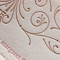
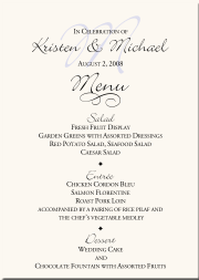 Bickley script was designed by Alan Meeks in 1986 and is based on the handwriting forms popular at the end of the 19th century. The flowery capitals contrast beautifully with the delicate and reserved lower case letters, fit perfectly together and enhance the handwritten character of the font. Bickley Script looks as though it were written with a fine tipped pen and has an elegant, nostalgic charm. The font is best for headlines as well as short to middle length texts and should be set in point sizes of 14 or larger, and Bickley Script's capitals can also be used as initials with other alphabets. As is pointed out with this wedding menu design, Bickley can be well used on invitations
 to special occasions such as weddings or
on menus in restaurants.
Typefae Profile

Freak is a funky hand lettered font that just begs to be used for coffee house promo. It is best when used in sizes above 16 points and is even better when used for posters where it can be printed in giant sizes. It has been one of the more popular fonts on the net for years.
Designers: Todd Dever
Design date: 1995
Publisher: Cool Fonts
Type Face Profile

- Casual Script font, Sans Serif, fits the fifties category of font.
- An example of where Comic Sans is used is in movie posters such as Sin City, it is commonly used to imitate old school comic book fonts.
- Designed by Vincent Connare, a Microsoft designer
- Time period- October of 1994
History of typography

In 1456 Johann Gutenberg used a printing press to print the first book in the Western world. The Chinese and Koreans had been printing with moveable wood type for years, but their written languages are made of words rather than individual letters, so they were limited in what they could print easily.
-Gutenberg used knowledge gained from working with metal, as a jeweler, to find an alloy which allowed him to form individual letters. He cast the letters in mirror image, and then grouped individual letters into a matrix to form a page.
Wednesday, September 29, 2010
History of Typography

Time period- 1919
Where- Weimar, Germany
Who- german architect Walter Gropius
The core concept of Bauhaus was to re-imagine the materials of the world to reflect the unity of all arts. It combined fine arts and design education, the curriculum started with studies on materials, color theory and formal relationships in preparation for more specialized studies.
At the Bauhaus, typography was conceived as both as empirical means of communication and an artistic expression, with visual clarity stressed above all.
Bauhaus was mostly influential because it went against the standards of font and how text should be positioned on paper, in a time and country where everything was being very closely controlled by the government. They dared to take order and rearrange text and in doing so they made a very liberating statement.

Wednesday, September 22, 2010
History of Typography

Wood was used for letterforms (and illustrations) dating back to the first known Chinese wood block print first created in 868.
Darius Wells
established the first newspaper with William Childs in Amsterdam.
In 1826 he went to New York, and continued the printing business. At that time the largest metal type that was made was only twelve-line pica, and it cost more than the average printer could afford to pay. This led to his making large type from wood, and he followed the method of engravers by using cross-grained sections. The advantage of wood-type having been established, it was found necessary to devise means of manufacturing it with greater rapidity and less labor. In 1827 Mr. Wells found that by using a vertical revolving cutter a more speedy removal of the superfluous wood could be effected. This device, improved by various modifications such as the pantograph introduced by William Leavenworth in 1834
,is known as the routing machine.
Good Ole English

Black letter, also known as Gothic script or Gothic minuscule, was a script used throughout Western Europe from approximately 1150 to well into the 17th century. It continued to be used for the German language until the 20th century.
I really find this type of font interesting because has great characterization of each letter. I wouldn't mind getting a a Good Old tattoo of my name in this fantastic fonts.
William caslon: caslon Typeface


William Caslons' Typeace:

Typography, the design, or selection, of letter forms to be organized into words and sentences to be disposed in blocks of type as printing upon a page.
caslon typeface,
William Caslon , 1692-1766, English type designer, b. Worcestershire. He worked first in London as an engraver of gunlocks, then set up his own foundry in 1716. The merits of Caslon's types were rediscovered after a brief eclipse in the popularity of John Baskerville 's types. Caslon's individual letters are less impressive than those of Baskerville and Giambattista Bodoni , but their regularity, legibility, and sensitive proportions constituted a remarkable achievement in design. His typefaces were used for most important printed works from c.1740 to c.1800. One such example is the first printed version of the United States Declaration of Independence. Some Caslon types are still in use. His business was carried on by his eldest son, William (1720-78).
In 18th-century England & America, Caslon fonts came to dominate printing. Hot-metal revivals in the 20th century were legendary for readability. The letterpress printers’ adage was: “When in doubt, use Caslon.” William Berksondrew Williams Caslon to bring this comfortably readable classic into the 21st century, capturing in digital form the warm, lively, dark, and open look at the heart of this perennial favorite; FB 2010
CASLON, William Caslon (1693-1766), late 17th century early 18th century, England, Old Style. This font is more of an old style used back in the early years of typefaces beginning. I would use this font if I was writing a book, poster, brochure things of that sort. Caslon cut excellent roman, italic, and Hebrew typefaces.
American Scribe Designed by: Brian Willson in 2003
Published by: Three Islands Press
Fontshop.com is the website that sells this font. The website tries to sell you 1 font for as cheap as $39.00.
Subscribe to:
Posts (Atom)