 this type is called Goombah. i got it from this site: http://www.cool-fonts.com. u should check it out.
Wednesday, September 30, 2009
seblester.co.uk

This site has some excellent shots of "found" type. There's also these beautiful type sketches...
I adore type in the raw.
Monday, September 28, 2009


Friday, September 25, 2009

Wednesday, September 23, 2009

Tuesday, September 22, 2009
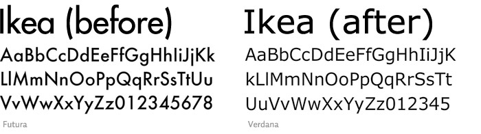
What was Ikea thinking???
Typography Fans Say Ikea Should Stick to Furniture
..."when Ikea casually abandoned its version of the famed 20th-century font Futura that had served it for 50 years and replaced it for 2010 with the computer-screen font Verdana, professional outrage was immense." (Verdana....is THIS font!)
See the comparison here on idsgn.org.
My opinion?
I think Verdana seems week compared to the strength/weight of Futura. Verdana seems smoother, and therefore less bold, than Futura, with it's lack of sharp angles on the baseline. Verdana also reminds me of simple writing, like something you would see in a catalog. ho hum boring. I just detest Microsoft. This is a no-brainer. Futura wins.
What do you think...Futura? or Verdana??

Fonstruct—Make your own font!

WHAT total font coolness! Complete font nirvana.
It's called Fontstruct.
I found a site today that lets you create your own font! There's tools to make your own font AND DOWNLOAD IT to your machine! AND clone another persons' font, adapt it, and change it and make it yours. Holy crap this is cool. There is a gallery of previous created fonts made by folks like you and me that you can view and also download. Not only that. Fonts that other people have created are there for download in the sites' gallery. Whoa, this is a font goldmine.

Look out GART Class 151C. You will be looking at this in class!
The Undiscovered 27th Letter
"Cause you can’t see tits on the radio. Fasten those pants for the lap dance. a story about my letter. proximity, similarity, continuity, closure, circle, square, triangle, sound, shape, typeface, lip and mouth movement, sign language, script, print, roman, italic, uppercase, lowercase, vowel, consonant, foreign language, how to draw, how to pronounce, letter frequency, how would it change existing words, sound length, tone group, syntax, semiotics. did someone say salami?"

The undiscovered letter is a way of communicating when regular words just won't do. Sometimes called "Jibber Jabber" or "I make more money than you"—this technique is most commonly employed in hip hop music.

The Art Directors Club held a competition last year for designers to come up with a 27th letter. It was called The Undiscovered Letter. There's some crazy stuff on this site! There were 27 finalists and their work is posted online here.
The undiscovered letter is a way of communicating when regular words just won't do. Sometimes called "Jibber Jabber" or "I make more money than you"—this technique is most commonly employed in hip hop music.
The Art Directors Club held a competition last year for designers to come up with a 27th letter. It was called The Undiscovered Letter. There's some crazy stuff on this site! There were 27 finalists and their work is posted online here.
Monday, September 21, 2009

Sunday, September 20, 2009
Diacritical, stress and accent marks

In order: circumflex, acute accent, dot, caron, ring/angstrom, tilde, crossbar, overlay slash, macron, tilde, acute accent, circumflex, german Eszett, comma below, cedilla, umlaut, caron, grave accent, cedilla, period.
Set in Gill Sans.
Thursday, September 17, 2009
A Gift from Veer
Veer sells stock images and also fonts. They have some crazy promotions...and today I got an email about this insane little Activity book .pdf that they are offering free online. I downloaded it and there's some good graphics and silly font and illustration related stuff in it.
Check it out!

Wednesday, September 16, 2009


Typedia

This is a really cool type resource site. It was formed with the idea of having a type community to help classify and identify typefaces. There's a lot of info there, including a super good anatomy chart you could use to study for the upcoming quiz...

Monday, September 14, 2009


great font.....i want my tattoo done in this, and i think it will look good for whatever you may want to say


I want a tattoo
I am looking to get a tattoo that says: LOVE.
It's going to take up about, >6 inches.
Saturday, September 12, 2009
Tattoo Me

I used this font, called Violation, for my tattoo and it proved too delicate—over the years the script's counters have filled in and the strokes have blurred. It's illegible now.
Thursday, September 10, 2009
Helping Nick pick out a script tattoo font
Nick asked me about a script font for a tattoo. Here's some of my faves.
Eduardo Recife has this crazy site, Misprinted Type. I have Luv luv luv 4 this site! He's got some cool free fonts. Did you hear me? I said FREE. Follow that link!
Turns out he also designed the font I used on my book I just published on blurb. (you can check it out here if yer curious)

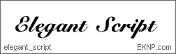
This is Elegant Script. I kind of like it's awkwardness. EKNP.com


Holy Crap! This isnt' script but it's I like it for a tattoo!!
The name is insane. Seriously.
King Things Spikeless

There's some options Nick. Anyone else got any ideas? Good luck!!
Eduardo Recife has this crazy site, Misprinted Type. I have Luv luv luv 4 this site! He's got some cool free fonts. Did you hear me? I said FREE. Follow that link!
Turns out he also designed the font I used on my book I just published on blurb. (you can check it out here if yer curious)
This is Elegant Script. I kind of like it's awkwardness. EKNP.com
How about a Walt Disney Font? Ugh. I don't like it. But still, the comic look may be interesting if that's your thing.
From Simply the Best Fonts. (that's debatable)
Holy Crap! This isnt' script but it's I like it for a tattoo!!
The name is insane. Seriously.
King Things Spikeless

There's some options Nick. Anyone else got any ideas? Good luck!!

GameFAQs

GameFAQs (Frequently Asked Questions), a site I like to visit, had a font I really liked so I figured I would post it, since im waiting for composition to start, and really don't have anything else to work on
Wired thinks Ebooks are Ugly

To quote the article found here on Wired:
“There’s a dearth of typographic expression in e-books today,” says Pablo Defendini, digital producer for Tor.com, the online arm of science fiction and fantasy publisher Tor Books. “Right now it’s just about taking a digital file and pushing it on to a e-book reader without much consideration for layout and flow of text.”
So, perhaps you students can use your new typography knowledge to become a designer for the kindle!
Another quote:
"Designing a cover specifically for an e-book is rare: Most e-book covers are digital images of their print namesakes. That’s likely to change soon, says Savikas, who compares e-book stores today to how Apple’s iPhone App stores were when launched."
Note to Graphic Arts People: Do you see that? These are new jobs just waiting for you to fill.
Friday, September 4, 2009
A Vacation Without KODAK
Is a Vacation Wasted.

Nice kerning on the word "vacation."
I found this in the DUKE University Libraries Digital Collection. There are TONS of ad examples on this site. Find 'em here, yo.

Nice kerning on the word "vacation."
I found this in the DUKE University Libraries Digital Collection. There are TONS of ad examples on this site. Find 'em here, yo.
Subscribe to:
Posts (Atom)