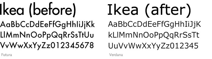
..."when Ikea casually abandoned its version of the famed 20th-century font Futura that had served it for 50 years and replaced it for 2010 with the computer-screen font Verdana, professional outrage was immense." (Verdana....is THIS font!)
See the comparison here on idsgn.org.
My opinion?
I think Verdana seems week compared to the strength/weight of Futura. Verdana seems smoother, and therefore less bold, than Futura, with it's lack of sharp angles on the baseline. Verdana also reminds me of simple writing, like something you would see in a catalog. ho hum boring. I just detest Microsoft. This is a no-brainer. Futura wins.
What do you think...Futura? or Verdana??
Definately futura. Did they not consult anybody on that change or what?
ReplyDeleteI have no idea! Seems foolish! Especially since they are the laughingstock of the internets!
ReplyDeleteFutura looks mature.
Verdana looks grade school.
To go from Futura's single-story "a" to Verdana's two-story "a" is a huge formal leap. And don't get me started on the cap "I"'s arms.
ReplyDelete