Wednesday, September 21, 2011
Y is this blog site name "COBY" ?
Tuesday, January 4, 2011
Upper & Lower Case
It's online now, for your typeface web browsing needs!
Go here to visit them. Catch up on some type news!
Thursday, October 21, 2010
Lets Get Digital
DaFaonts are Hot
Wednesday, October 20, 2010
Printing Process

Foundry Review
Most of their fonts are at more of an affordable price than there competitors for example Fonts.com has a particular font that I like named Lomo. You can buy either the full package of these fonts for $1,661.00 or just specific fonts from the Lomo collection for $54.00 each. There biggest competitor which just about everyone has mentioned in the blogs is Fontshop.com
They offer the same Lomo font but they don't offer it in single fonts, they sell it as a whole with 37 fonts for $1,499.00.
Gathering your information i.e image, text or both through an analog means like scanning in your document or through a digital means like a camera or word processor document.
converting your information; your file format needs to be converted to a usual file such as TIFF or EPS.
Typeface Profile.
History of Type.
Pictogram-History
While cave paintings, dating as far back as 20,000 B.C. are the first evidence of recorded pictures, true written communication is thought to have been developed some 17,000 years later by the Sumerians, around 3500 B.C.
They are known to have recorded stories and preserved records using simple drawings of everyday objects, called pictogram.
Pictogram- Modern uses
Pictogram remain in common use today, serving as pictorial, representational signs, instructions, or statistical diagrams. Because of their graphical nature and fairly realistic style, they are widely used to indicate public toilets, or places such as airports and train stations.Pictographic writing as a modernist poetic technique is credited to Ezra Pound, though French surrealist accurately credit the Pacific Northwest American Indians of Alaska who introduced writing, via totem poles.
Tuesday, October 19, 2010
Printing Process
I would actually recommend doing a movie poster this way because you can control the negative spacing while painting. Being in control of how you can form the lettering without having to use a pre-formed platform makes this a more profitable way to enjoy making something that is your own. (I apologize for not having a picture, the button wouldn't let me click it.)
"http://www.reuels.com/reuels/Silk_Screen_Printing_Instructions.html">http://www.reuels.com/reuels/Silk_Screen_Printing_Instructions.html

http://www.fontshop.com/fonts
Unfortunately, other companies do not sell this type font, but it is a personal designed font that ranges from 200.00$ to 400.00$ for font "families". I cannot for the life of me understand why someone would pay almost their whole weeks pay for a font. But for the initial reasoning, you only have to pay the one fee.
"Freelance Designers invest in those fonts for their duration of their career. These fonts are readily available for their immediate use for any design project, large or small." -Bianca Ramos, Graphic Design Major

http://www.evertype.com/celtscript/fonthist.html
DESIGNER: John Kearney
TIME PERIOD: 1571- 1658
CLASSIFICATION: Gaelic
During the early 16th century, a type was passed around Europe. The Irish had a specific language called "Gaelic", which was hand written or carved in gorgeous loops, curls and various flowery aspects. A man by the name of John Kearney, who was from Dublin, created the typeface for the Gaelic language and passed the blocks unto England.For the use of the Gaelic type, it would make a very eye catching and pleasing poster type. If you were to look at the type style on Tolken's book.... his very old, paper back copy of "The Hobbit" has it's cover typed with the Gaelic style, which gives it the feeling of an old fantasy tale about to be told. So many messages can be used visually by using the Gaelic type.
History of Asian Typography

The history of typography is a very broad topic to cover. For instance, many countries around the world have their own take of how they print their own lettering. Many countries have started with wood, steel and ink. One country in particular, Japan, has a very unique way of creating type. During the feudal era of Japan, many of the writing were done by calligraphy, which is the painting of letters with a brush of various tip sizes and a small well of ink. This was a painstakingly long and tedious endeavor.
As the turn of the century came, the wooden blocks were made as was a different method of lettering. Each wooden block would have a word embossed in the wood and each block would painted over with ink and lined up in an order desired. they are then placed in between two wooden presses and pressed down upon with force. The picture provided has a form of the woodblock pressing on a tranquil Japanese scroll.
In my own personal belief, the Japanese lettering can also be counted a-s an art form as well as well as a historical advancement of mass production of documents.
Foundry Review

Typeface Profile


History of Typography
Printing Process- Letterpress
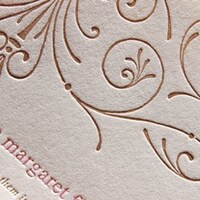
Your type or image will be indented into the paper. Using a raised surface printing plate or type, the depth of the resulting "bite" will vary depending upon the type of paper. Thicker, softer papers will carry a deeper impression than hard or thin papers.
Foundry Review
Monday, October 18, 2010
digital printing

- Gathering your information i.e image, text or both through an analog means like scanning in your document or through a digital means like a camera or word processor document.
- converting your information; your file format needs to be converted to a usual file such as TIFF or EPS.
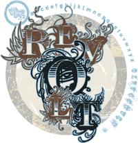
The Revolutionary Revolt
Revolt Is A Font That was Created By Douglas Vitkauskas