Wednesday, September 29, 2010

History of Typography


Bauhaus


Time period- 1919


Where- Weimar, Germany


Who- german architect Walter Gropius


The core concept of Bauhaus was to re-imagine the materials of the world to reflect the unity of all arts. It combined fine arts and design education, the curriculum started with studies on materials, color theory and formal relationships in preparation for more specialized studies.


At the Bauhaus, typography was conceived as both as empirical means of communication and an artistic expression, with visual clarity stressed above all.


Bauhaus was mostly influential because it went against the standards of font and how text should be positioned on paper, in a time and country where everything was being very closely controlled by the government. They dared to take order and rearrange text and in doing so they made a very liberating statement.


A Nice "S"


Sarah's S

Wednesday, September 22, 2010

History of Typography

Wood was used for letterforms (and illustrations) dating back to the first known Chinese wood block print first created in 868.

Darius Wells

established the first newspaper with William Childs in Amsterdam.

In 1826 he went to New York, and continued the printing business. At that time the largest metal type that was made was only twelve-line pica, and it cost more than the average printer could afford to pay. This led to his making large type from wood, and he followed the method of engravers by using cross-grained sections. The advantage of wood-type having been established, it was found necessary to devise means of manufacturing it with greater rapidity and less labor. In 1827 Mr. Wells found that by using a vertical revolving cutter a more speedy removal of the superfluous wood could be effected. This device, improved by various modifications such as the pantograph introduced by William Leavenworth in 1834

,

is known as the routing machine.

Find info and this "Pre-1826 hand-cut letter by Darius Wells" here and here

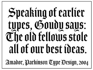
Good Ole English


Black letter, also known as Gothic script or Gothic minuscule, was a script used throughout Western Europe from approximately 1150 to well into the 17th century. It continued to be used for the German language until the 20th century.
I really find this type of font interesting because has great characterization of each letter. I wouldn't mind getting a a Good Old tattoo of my name in this fantastic fonts.

Sarah

I'm a Graphic Design major. BAWK!

William caslon: caslon Typeface


William Caslons' Typeace:


Typography,

the design, or selection, of letter forms to be organized into words and sentences to be disposed in blocks of type as printing upon a page.

caslon typeface,
William Caslon , 1692-1766, English type designer, b. Worcestershire. He worked first in London as an engraver of gunlocks, then set up his own foundry in 1716. The merits of Caslon's types were rediscovered after a brief eclipse in the popularity of John Baskerville 's types. Caslon's individual letters are less impressive than those of Baskerville and Giambattista Bodoni , but their regularity, legibility, and sensitive proportions constituted a remarkable achievement in design. His typefaces were used for most important printed works from c.1740 to c.1800. One such example is the first printed version of the United States Declaration of Independence. Some Caslon types are still in use. His business was carried on by his eldest son, William (1720-78).
In 18th-century England & America, Caslon fonts came to dominate printing. Hot-metal revivals in the 20th century were legendary for readability. The letterpress printers’ adage was: “When in doubt, use Caslon.” William Berksondrew Williams Caslon to bring this comfortably readable classic into the 21st century, capturing in digital form the warm, lively, dark, and open look at the heart of this perennial favorite; FB 2010


CASLON, William Caslon (1693-1766), late 17th century early 18th century, England, Old Style. This font is more of an old style used back in the early years of typefaces beginning. I would use this font if I was writing a book, poster, brochure things of that sort. Caslon cut excellent roman, italic, and Hebrew typefaces.


American Scribe Designed by: Brian Willson in 2003
Published by: Three Islands Press
Fontshop.com is the website that sells this font. The website tries to sell you 1 font for as cheap as $39.00.


Wednesday, September 15, 2010

Gabrielle Rose


I am a communications major at SUNY Cobleskill

Denzel Price


Eyy
, I'm a graphic design major.

Renee Rondot


I am A communications major at SUNY Cobleskill.

Raven


I am a Computer Graphics and Design student.

Tyler Schell


My major is in IT.

Dan Foley


I am a -Website Design and Development- major at Cobleskill.

Amanda Fortune


I
am a communications major.


Kumasi Knight


I am a Graphic Design Major.

Wednesday, September 8, 2010

Multigraphs in an office


Old time typesetting....done on Multigraph typesetter. These machines were designed to run off 3000 - 6000 copies an hour, provided you could turn the drum that fast!